Accessibility
The text fulfills all WCAG-standards. All images are meant to have alternative text and the website is universally designed. All elements ar clearly distinguishable for the colorblind.
Typography
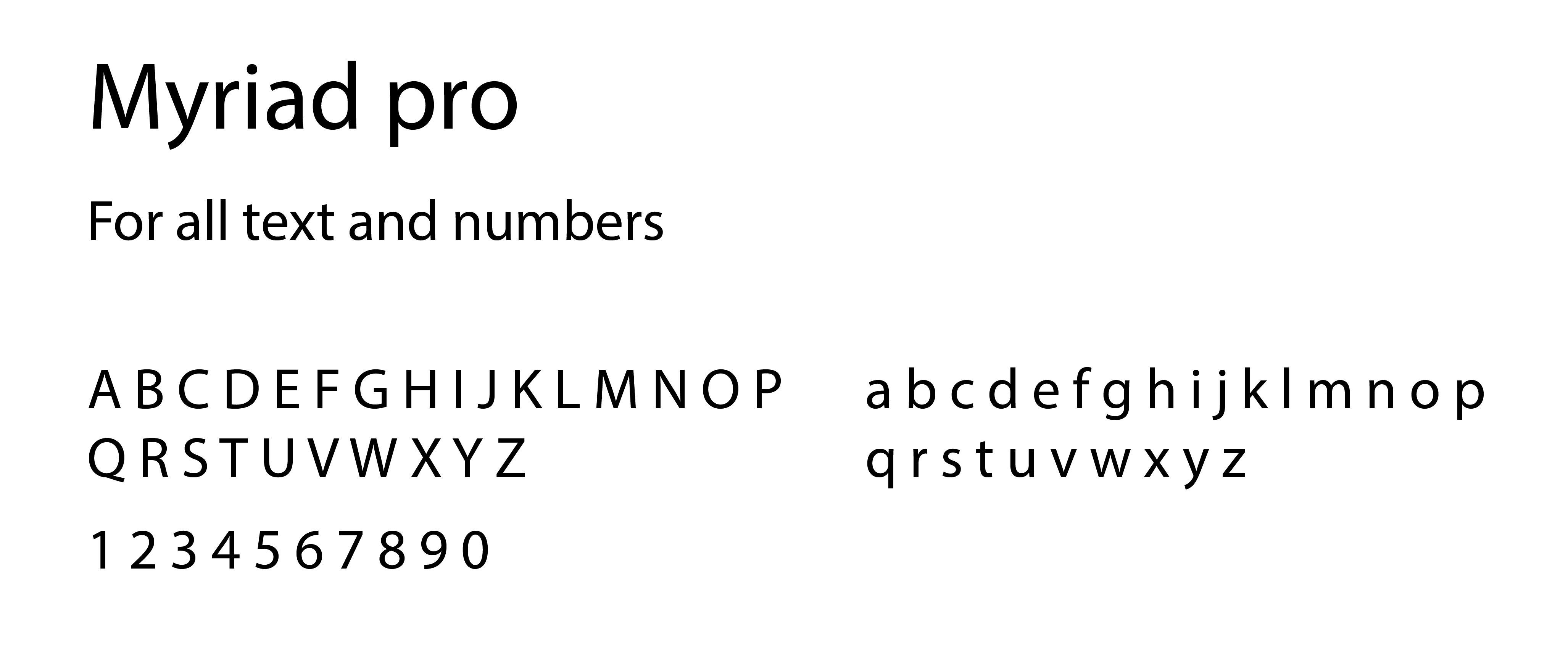
I used Myriad Pro for both headlines and paragraphs. It is a neutral font used by Apple. Therefore it will feel natural on iPhone, which was part of the task in this project.

Colors
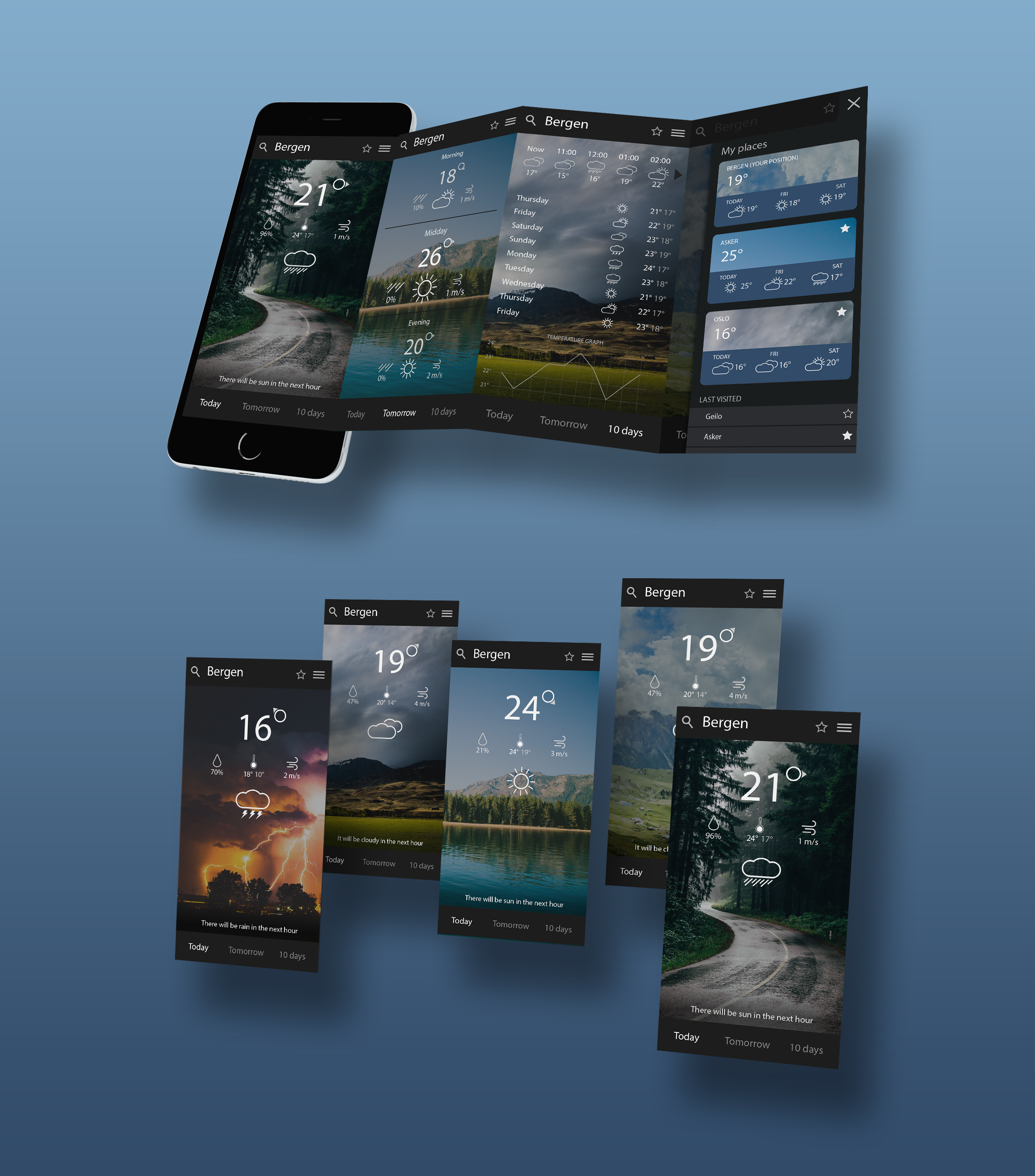
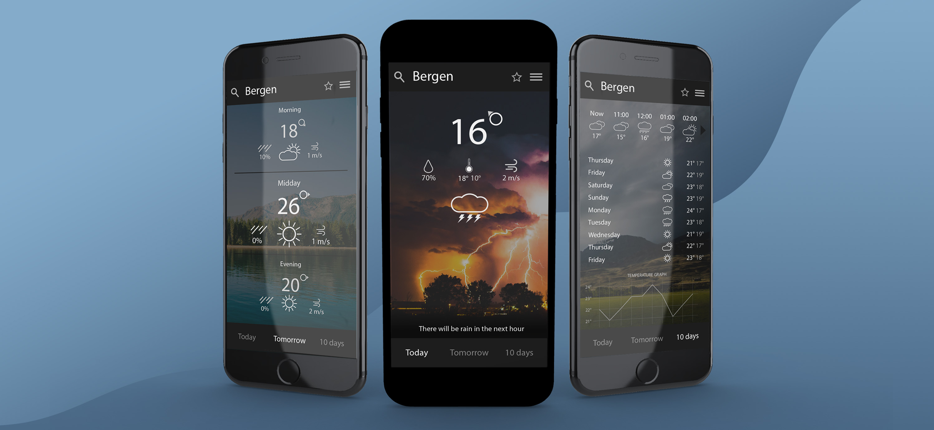
Primærfargen i appen er en noe desaturert kaldnyansert blå. Blå forbindes blant annet med profesjonalitet og vann, og egner seg derfor godt til vær-apper. Jeg valgte mørke farger for å skape en dramatisk og følelsestung stemning for å fremheve den påvirkningen vær kan ha på vår sinnsstemning. The primary color in this app is a somewhat desaturated and cold tinted blue. Blue is associated with professionality and water, and is a good fit for a weather app. I chose dark colors to create a dramatic an emotional ambience to highlight the influence weather can have on our mood.
App

Design process
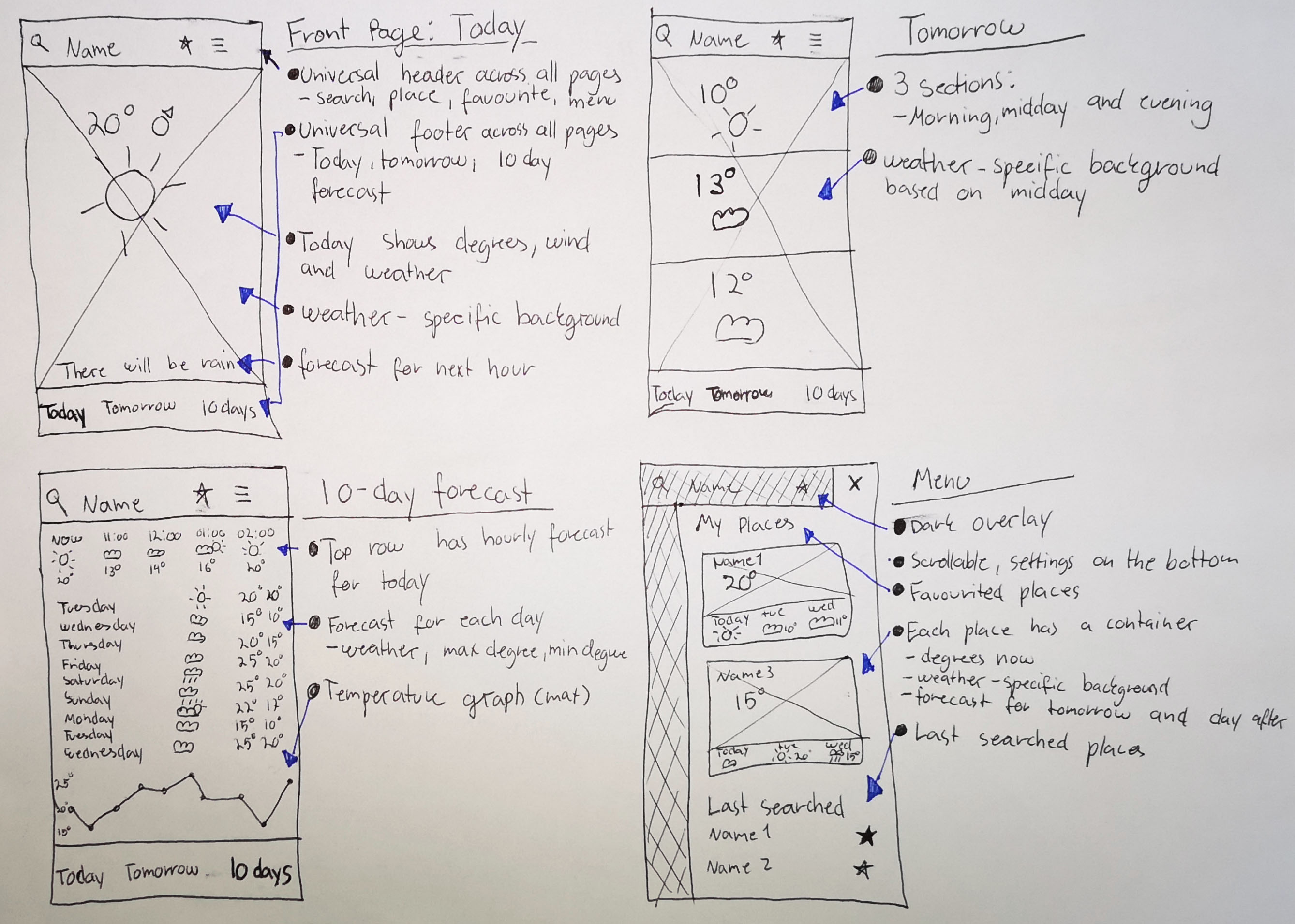
This project started with an assignment at the university where the objective were to design an app for weather forecasts. I decided to start the redesign of this app from scratch with crazy 8s, wireframe and iteration of the design with friends as testers.

