What's the use?
DNT's users are very varied in both age and trekking experience. They are both youths and seniors, and while some are just now beginning exploring the Norwegian nature others are experienced adventurers. As such, the website needs to be flexible to meet all the user's needs. It will be used for both exploring which cabins the users can trek to alone and to find organised short treks in the user's local community.
Goals
Business goal
Build a website that contributes to generating revenue by inspiring users to become members of The Norwegian Trekking Association.
User goal
Create a motivating solution that is inspiring and simple to use for all the different user groups and that meets their different needs.
Project Goal
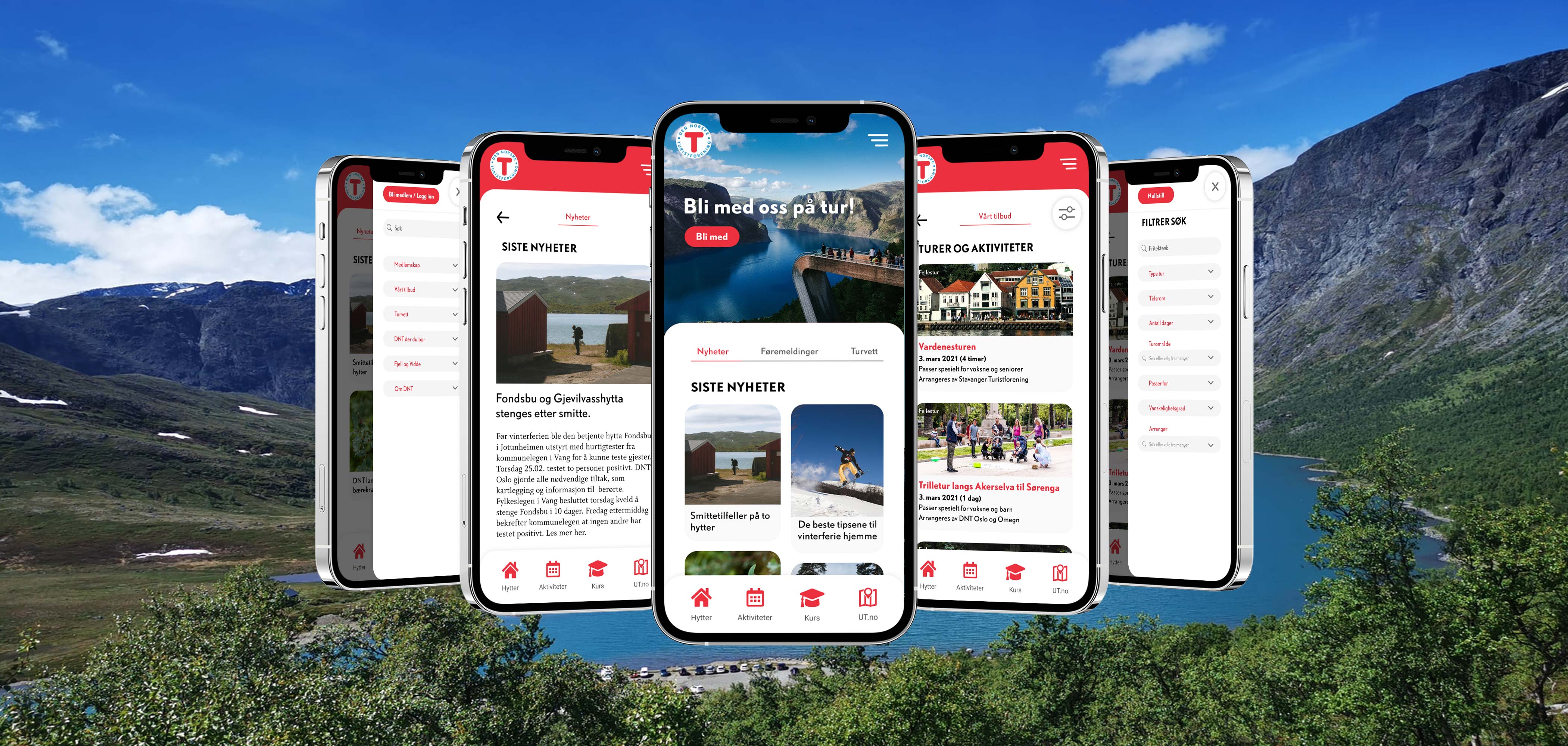
Design and create a S&M prototype the the DNT website to show key elements and how the identified challenges might be solved.
Accessibility
The text fulfills all WCAG-standards. All images are meant to have alternative text and the website is universally designed. All elements are clearly distinguishable for the colorblind.
Typography
All fonts are in line with DNT's visual profile, a document that's available online here. The main font is DTL Nobel to assosiate to mountains, and the paragraphs use Whitman for readability.
Colors
The color palette is based on DNT's visual profile as well. I have only used white, light grey and DNT's famous red to keep the design clean no matter which pictures are added to news articles and such. The paragraphs are dark on light background for quick and easy readability on the go.
Prototype
Larger version HERE.
The prototype can be found HERE. However, it works best on a computer.
Design process
The Miro board I used for the analysis and planning of the design can be found HERE.
I started the design process by exploring DNT's visual profile. This is something every designer will have to relate to in similar projects. The visual profile determines both formal requirements as well ass looser guidelines.
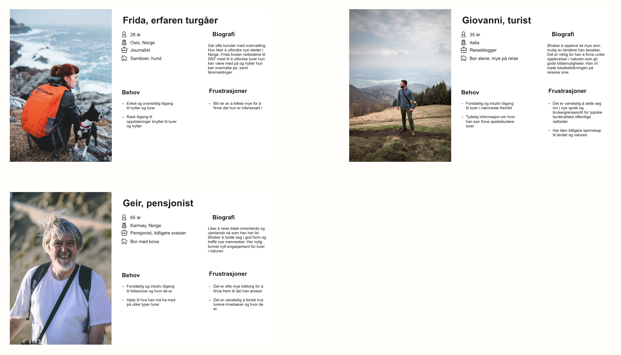
I then created personas based on heuristic analysis to better be able to identify the users of the website. It seemed like the mobile version would be the most important, so I designed "mobile first" for this project.
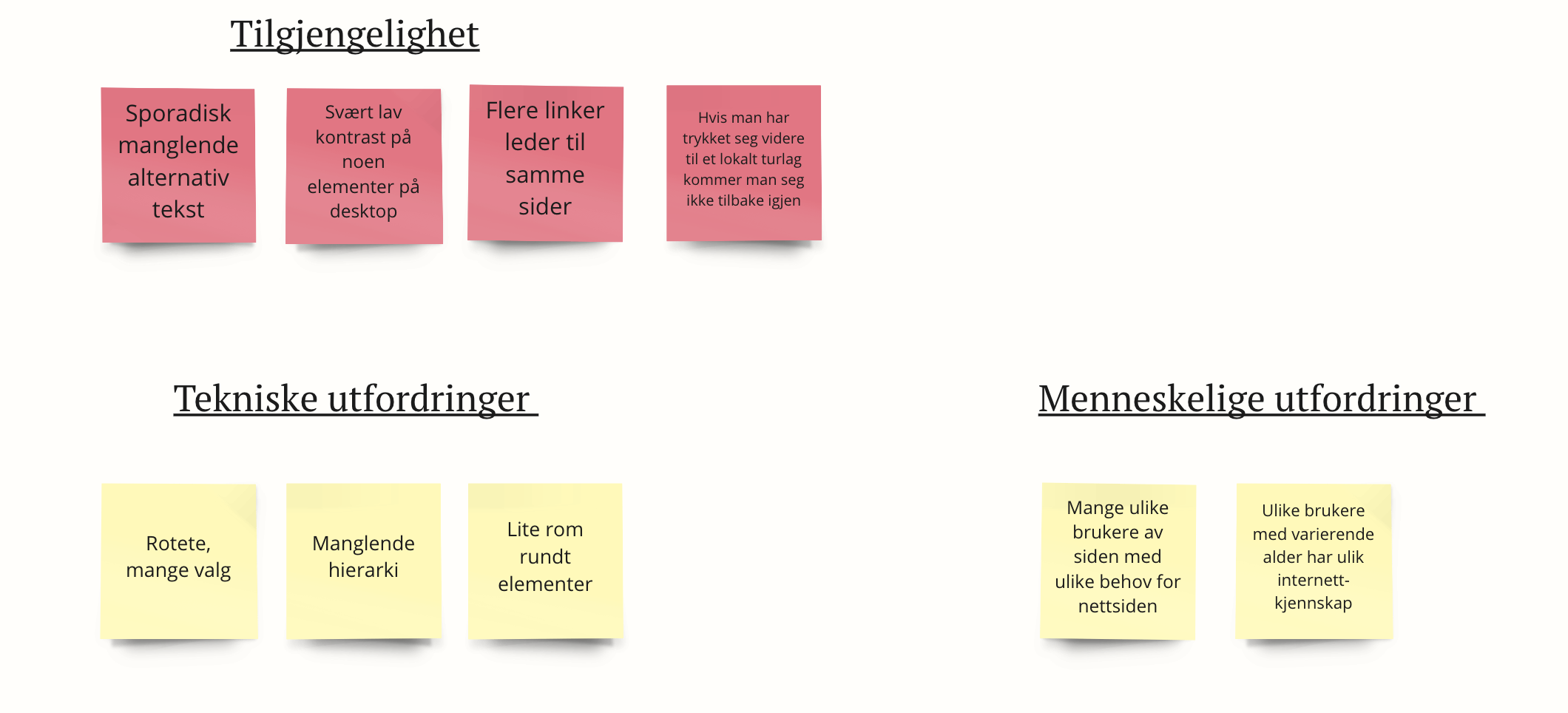
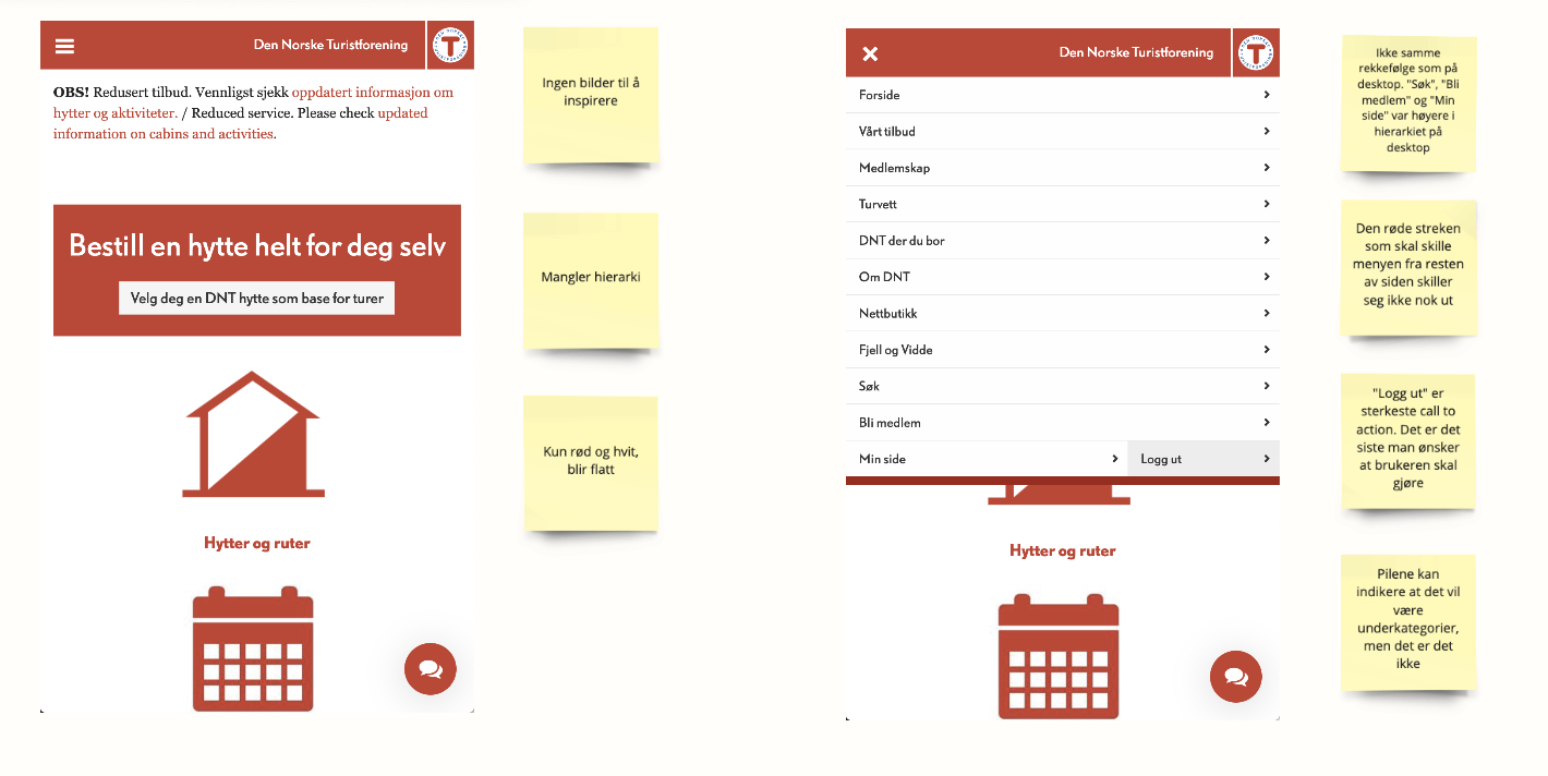
 I then carefully analysed the website design as it was online at that time and identified challenges with this design on both mobile and desktop.
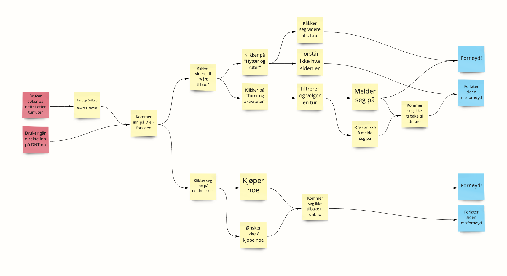
 I mapped the user flow and wrote down the key challenges, wrote HMW and looked at and added in lightning demos.
