What's the use?
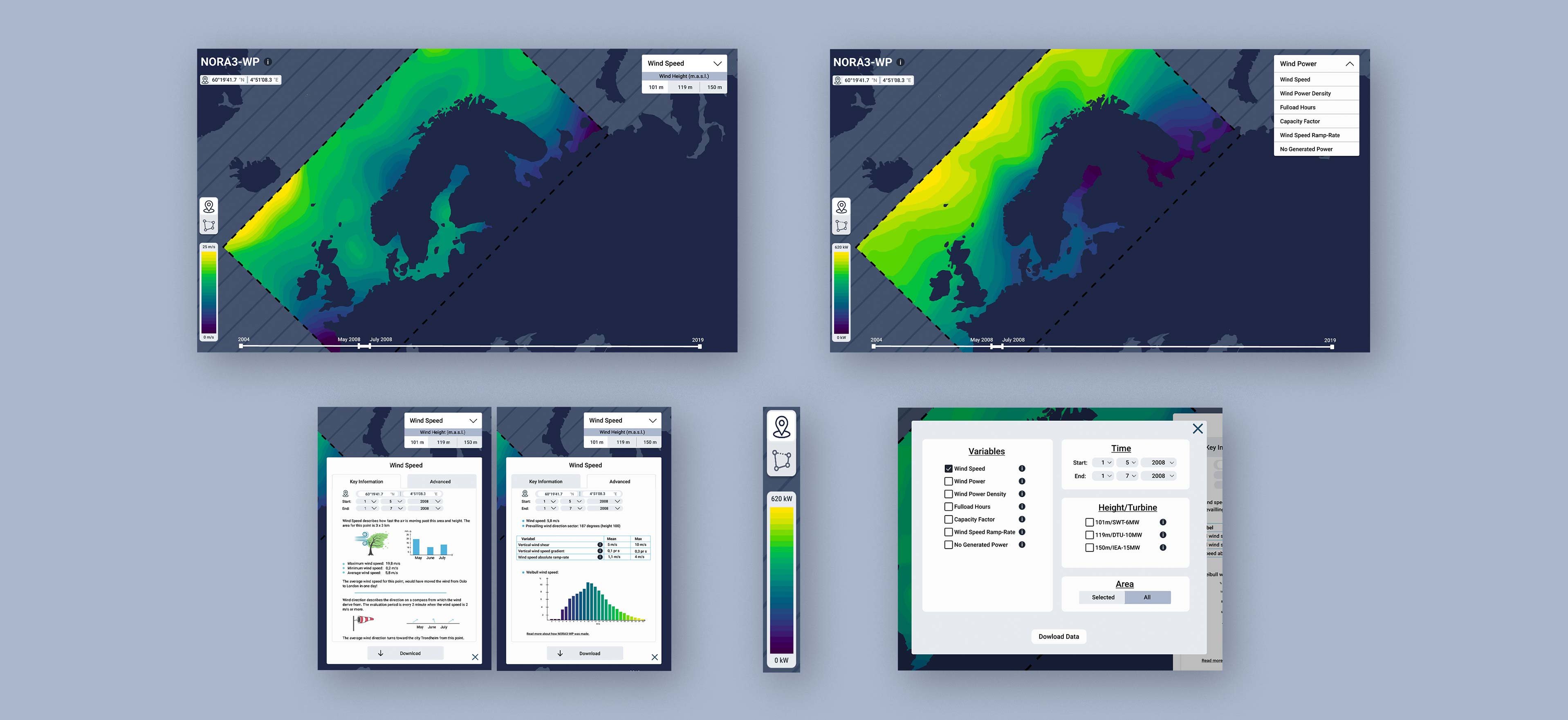
This visualisation aims to target both wind data-experts as well as regular non-expert users. The experts will use this tool to get a general and comparative overview of where it is useful and profitable to build wind parks. Non-experts include journalists and politicians with usage such as including screenshots and data in articles and reports.
Accessibility
The text fulfills all WCAG-standards. The tool is universally designed.
Typography
All text uses Roboto for high readability on both computer monitors and on big TVs or projectors for presentations, as the latter is a need we uncovered in the user testing.
Colors
The main color palette is the Viridis colormap for accurate display of data. This colormap ranges from dark purples and blues to bright greens and yellows to work well for both the color blind, in black and white print and to accurately display the data. This is the essential and non-negotiable choice for a visualisation like this. Having all of these colors as the background, the light grey color for the foreground elements contrast well, as the brightest colors will be rare in the map.
Prototype
The prototype will be added as soon as possible, due to the recency of this project and the pending reviews.
Design process
The process for this design and testing was anchored in Google's Design Sprint, stretched over time to accomodate the current circumstances of doing everything digitally, as well as to include BOW in the process.
