Accessibility
The text fulfills all WCAG-standards. All images are meant to have alternative text and the website is universally designed. All elements are clearly distinguishable for the colorblind.
Logo
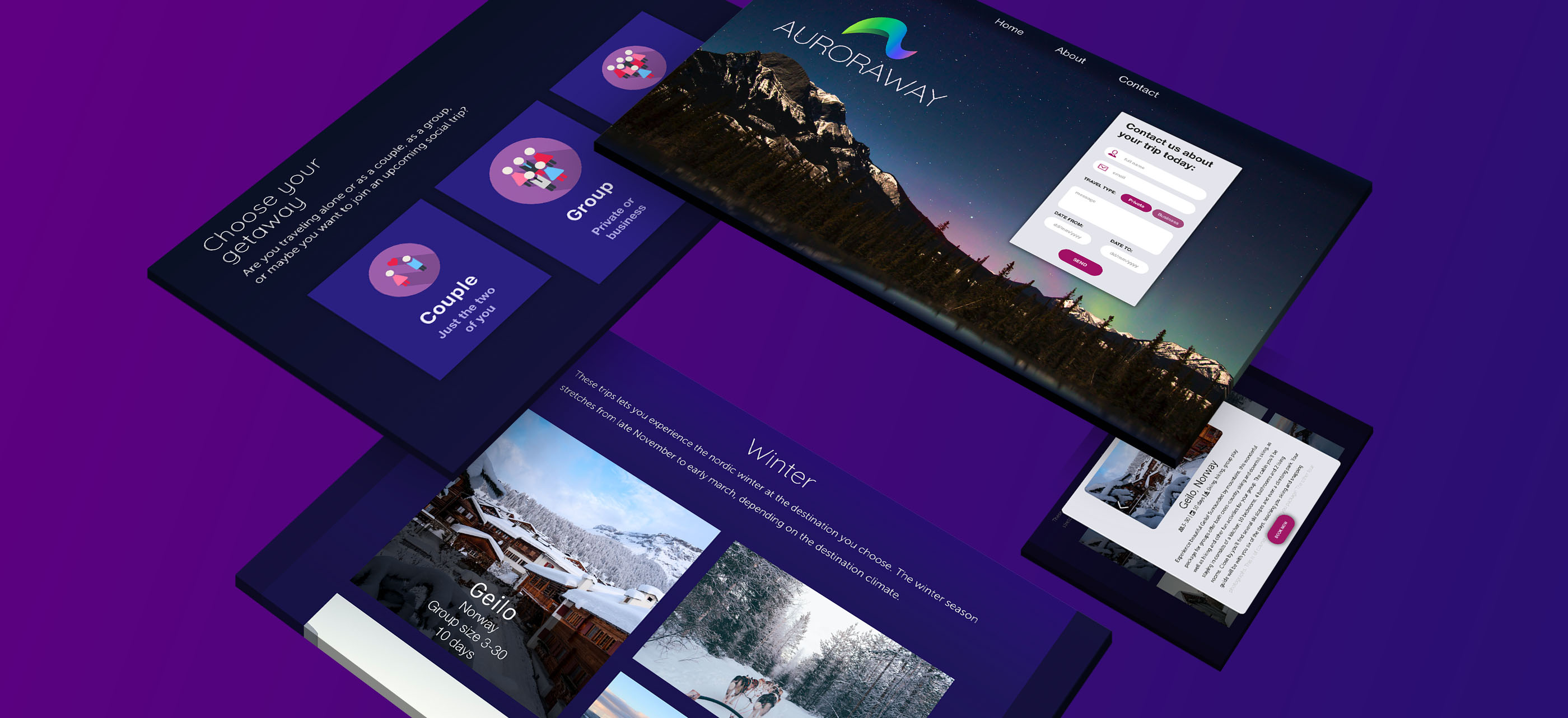
The logo is simple and modern. It is inspired by the northern lights to give associations to Auroraway's destinations.
Typography
All the fonts are sans-serif to be light and playful. Quicksand is a thin font with a lot of movement and can be used for both logo and headlines. Museo sans is a another playful font with better readability that is more suitable for paragraphs. Helvetica Neue is more decisive and is a good fit for call-to-action-buttons.
Colors
The primary color in this design is a relatively dark purple. I chose this color because purple is associated with luxury and mystery. The cold tint helps set the scene for the cold Northern countries. Combined with warm pink and white this pallette creates a playful an welcoming ambience.
Website
(Might take som time to load)

Design process
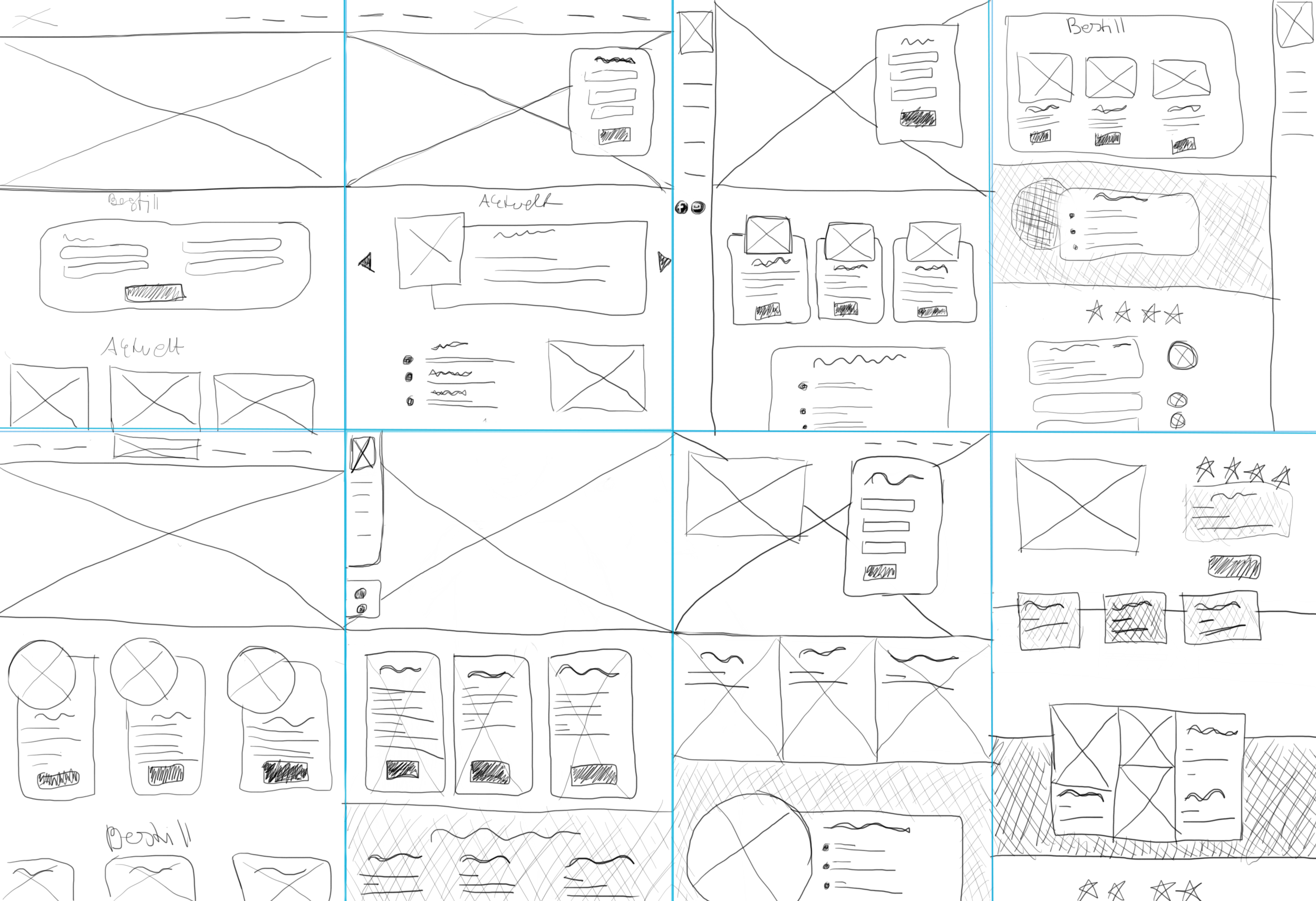
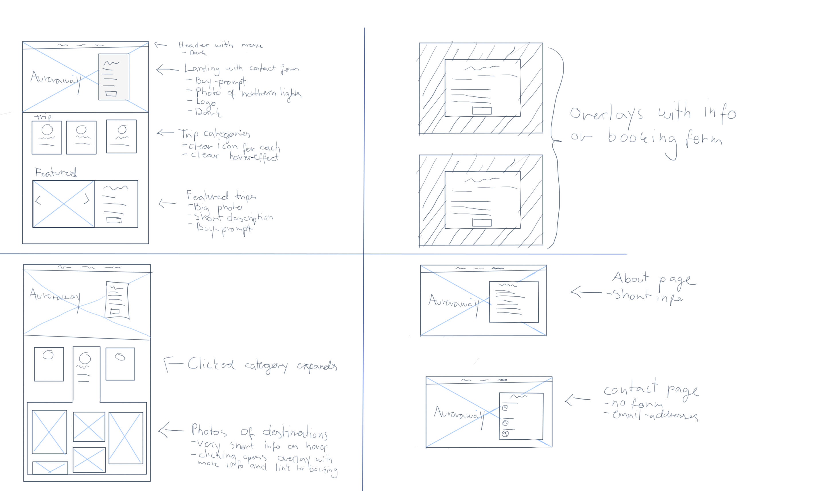
I started the design process with mapping the user journey. From there I did crazy 8s and made a solution sketch(Design sprint) or wireframe.


